Rebrands for new business ventures.
The Project:
Gold Package
The Brief:
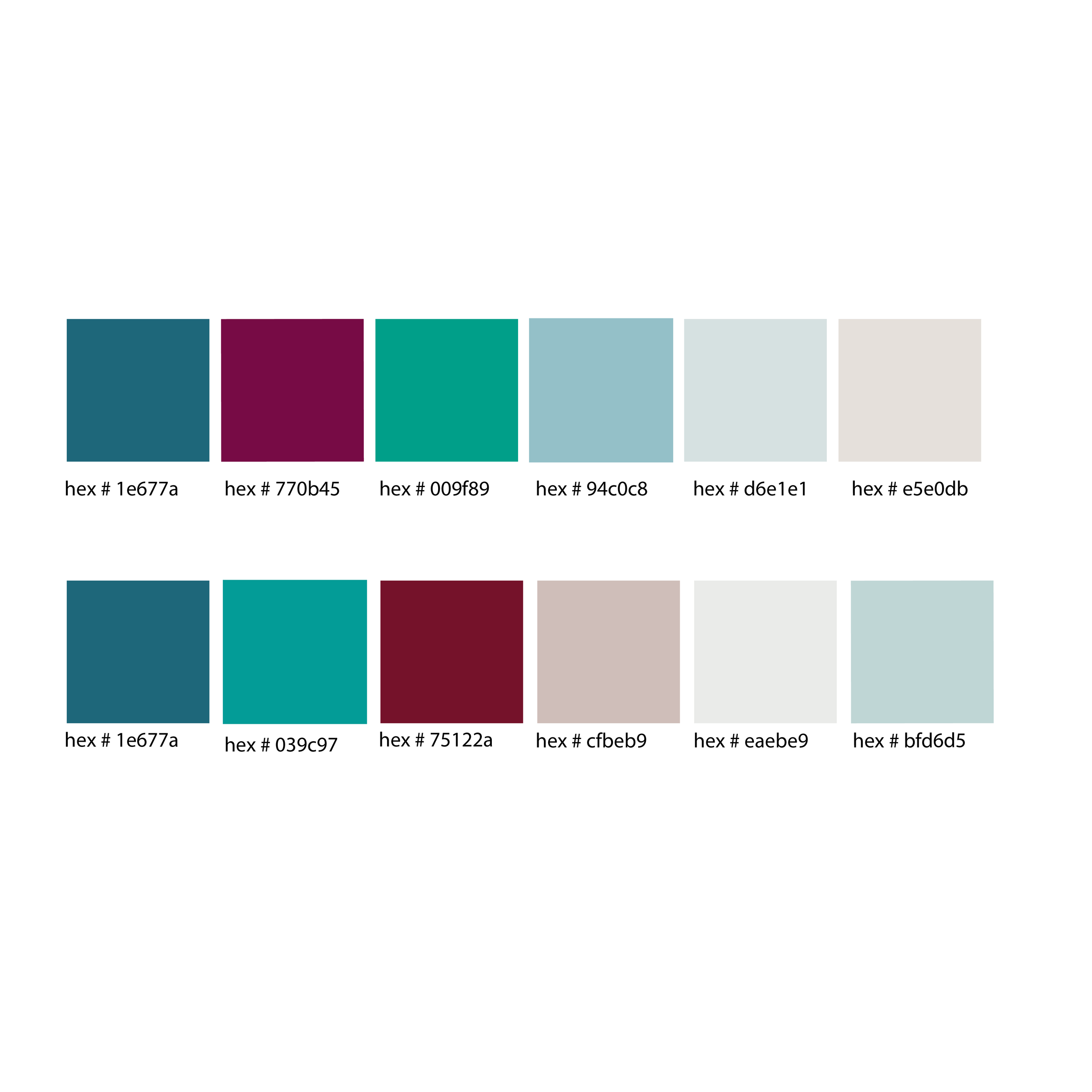
Choice connected with our team in need of a brand boost, but after an in depth audit of their social media and website they decided their next step was a rebrand. As Choice expanded their company, the main objective of a rebrand was to create a new logo that was reminiscent of their previous brand, but embodied the new avenues of their business. Our team created additional sublogos for each of the business ventures Choice launched with their rebrand, including the Choice Retreat, Collective, and Podcast. Deepening the tones of their original teal color palette and introducing berry contrast tones, we delivered branding that reflected where Choice came from, and where they were headed.
The Deliverables:
10 logo variations, full 3o page brand guidelines document, print and digital collateral
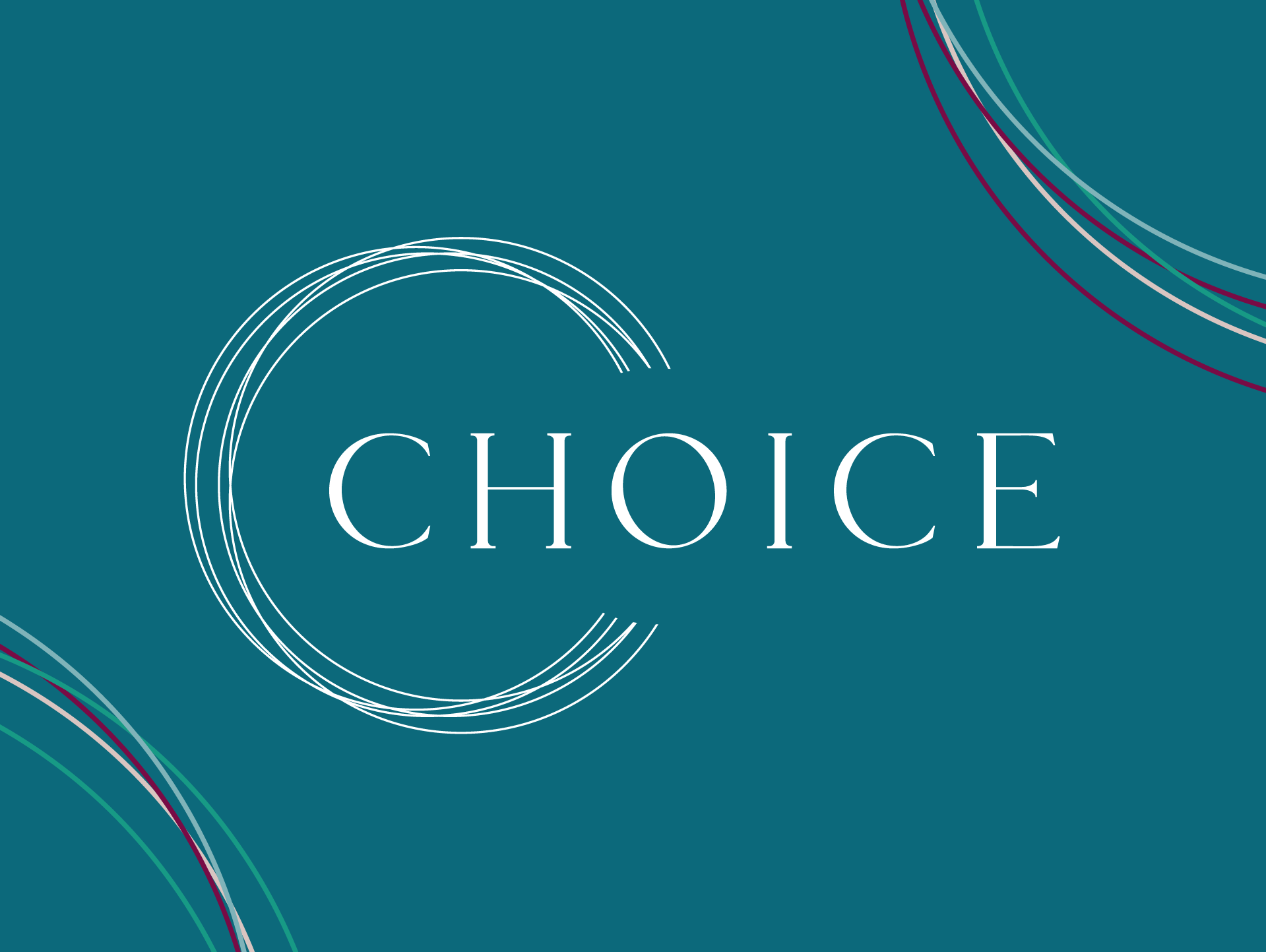
What started with a brand boost kickoff call with team Choice turned into one of our most extensive rebrands. To effectively reach their audience we kept their new branding recognizable with similar teal tones that Choice’s team most identified with while introducing a broader range of tones to provide contrast. One of our favorite elements of this logo was how their values were a major contributor to the logo design with the five rings of the circle representing their five core values.
Our deliverables included both digital and print collateral with the new colors, fonts, and circle motif that became the primary brand element. As a media and communications company, Choice has implemented each of their new branding pieces into their business seamlessly, helping expand their reach and showcase their new services.


