Elevating your current brand is a balancing act.
The Brief:
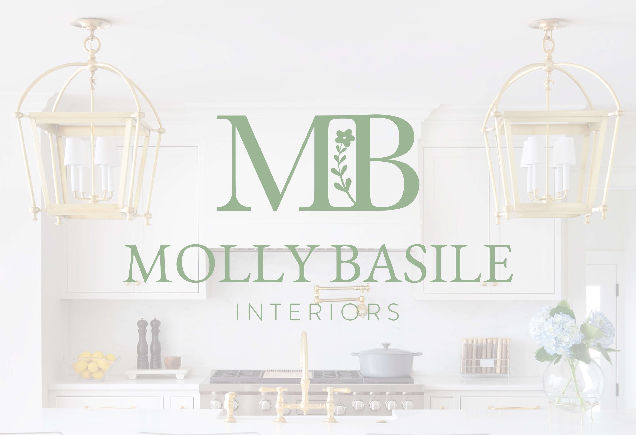
The branding process for Molly Basile Interiors centered around the idea of balance. In our initial call, Molly shared that she wanted her new brand to reflect the floral elements of her design work while rendering a sophisticated quality she felt her current brand lacked. Our team was tasked with the challenge of making a logo that was consistent with Molly’s previous branding and recognizable by her customers, but that incorporated these elevated elements that polished her brand. Combining a classic font pairing with the hand-drawn floral motif, accented by subtle green tones, we delivered a brand that was both welcoming and poised.
The Deliverables:
5 logo variations, 2 page brand guidelines
We began by having Molly fill out a survey that invited us into her vision for her new branding. Then, we got to work.
Because the end goal was for the brand to be recognizable by her current clients, we kept the green color palette similar to the green that was used in her previous branding. Next, we searched for a serif font that was both modern and classic to add the sophisticated edge the brand needed. The final touch: a flower motif that mirrored Molly’s favorite patterns that she uses in her interior design work.
These elements are what make this brand consistent, elevated, and personal.
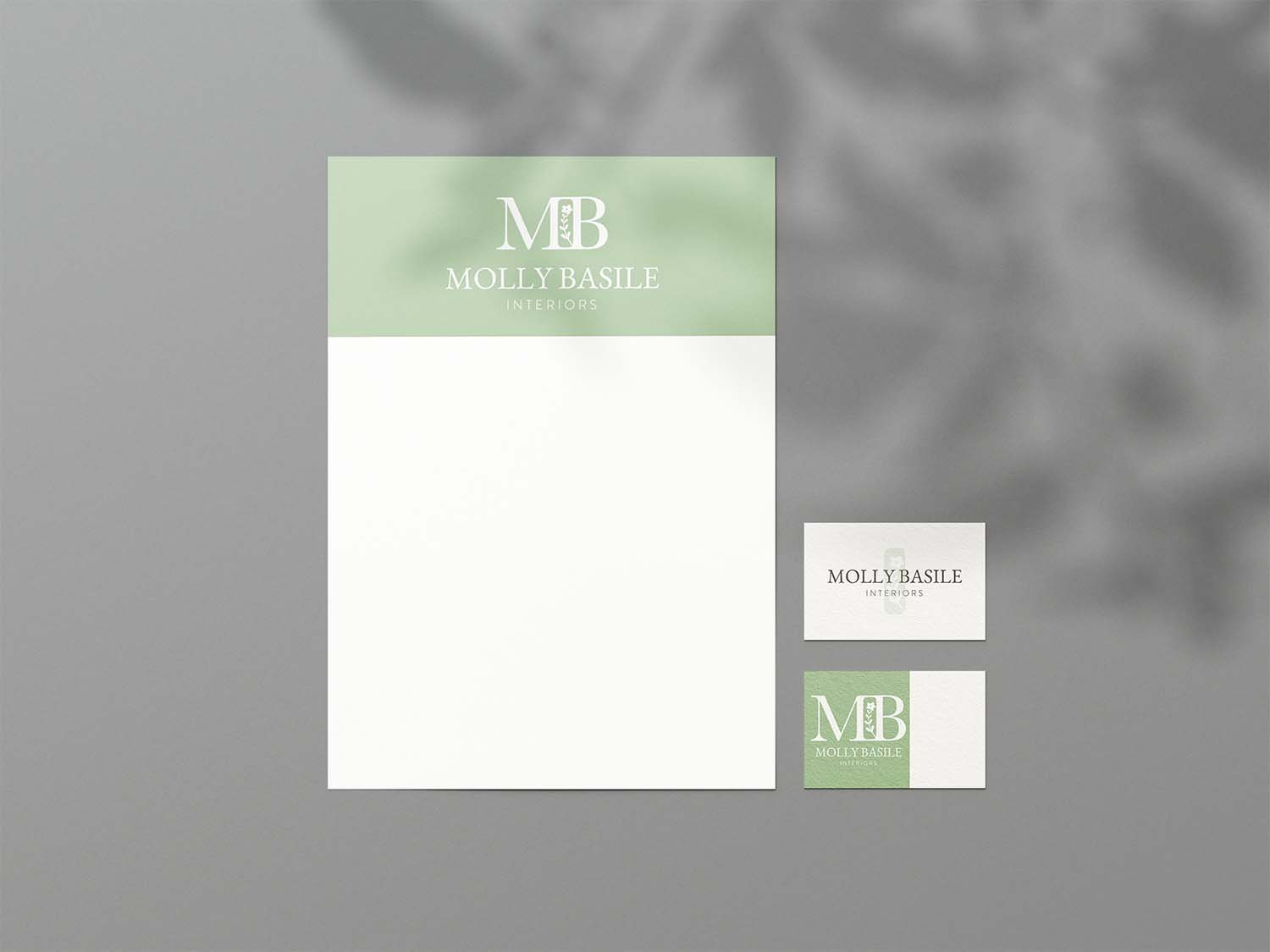
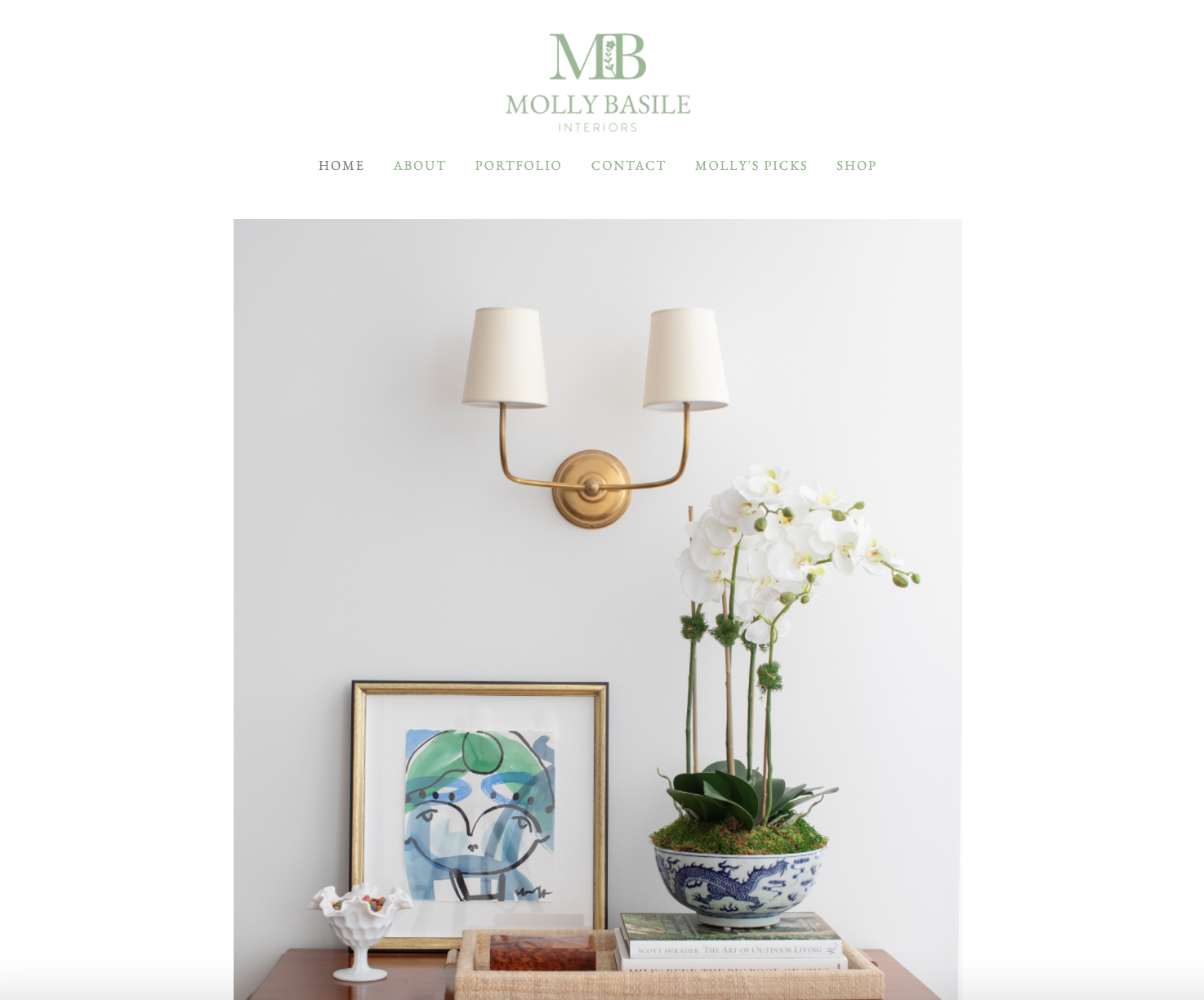
If your business is versatile, your branding should be too. We crafted logo variations that can be implemented on many different types of collateral so that our client could adjust and adapt her content as she saw fit.
We delivered brand guidelines that display the font pairings + color palette so that Molly can easily integrate these elements in all of her work.
Since handing off the new brand to her, Molly Basile has strategically and seamlessly woven her branding into much of her business and we are so thankful to have played a part in sharing her story.
