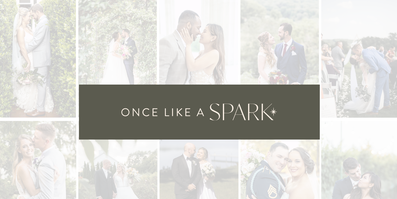
Once Like A Spark is a family-owned, women-owned business founded by two sisters who poured their hearts into creating a wedding experience like no other.

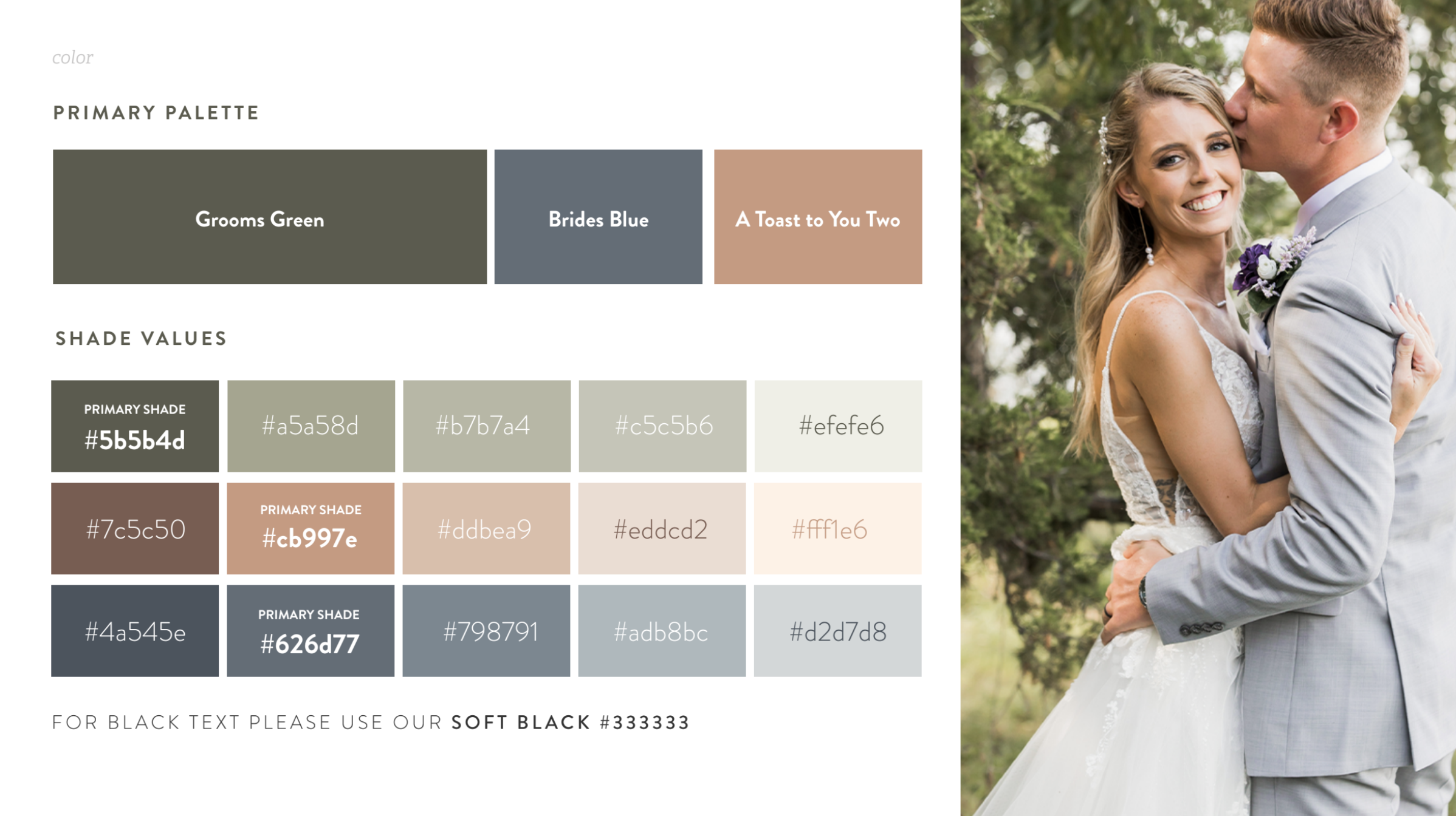
Together, we created a new visual brand identity that truly embodied Once Like A Spark’s ethos.

For the moments that matter.

Collection of twelve geometric patterned tiles in earthy and muted tones, including shades of gray, brown, beige, and green, featuring star, diamond, and abstract shapes.
Six diamond-shaped icons with star-like symbols inside, in three colors on top row (dark green, beige, brown) and three colors on bottom row (light gray, light green, dark gray), all against a black background.
Text saying 'Once like a spark' with a small star graphic on a gray background.
A wedding photo showing a bride and groom embracing outdoors, with trees and greenery in the background.

Are you interested in elevating your brand?

Fill out our inquiry form to tell us a little more about you and your business and schedule a call with us!

LET'S GET THIS PARTY STARTED!